

My first professional programming role was developing a message switch in Motorola 68000 assembler. Well I say assembler, for historic reasons we wrote code in a home brew macro assembler which took the best part of 24 hours to compile down to assembler and then binary. Given the length of time to compile, bugs were fixed by ‘patching’ the executable in hex.
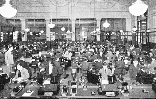
The system made its sales pitch on the number of telex machines it could replace. In the days when the communications floor of a bank or brokerage would have dozens of telex machines to allow a RFQ to be sent to multiple brokers at the same time.
I digress from the main point which was this system had the most atrocious user interface. Not only was it green screen (or teletype) but it had adopted the terse format of IATA telex messages. A message started with ‘ZCZC’ and ended with ‘NNNN’. Commands were similarly terse, typically a 3 letter repeated sequence to start a command to configure the system and the familiar NNNN to end it.
My initial task on joining was to look at layering a menu system on top of this cryptic command format to make it easier for users. After several months of development I managed to create a data driven framework to support the menu system.
On demonstrating my creation to one of our key clients, their immediate reaction was ‘You are not going to get rid of the command line are you?’ Of course, as they used the system day in and day out, they knew all the commands by heart, for them execution time was more important than easy access.
A few years later I worked at Galileo, the airline booking platform. Brought in as a Windows developer, my job was to develop a Windows based travel agent booking system that integrated with the existing system based on the United Airlines platform.
Now airlines had been early adopters of computers and built platforms in the 1960s using IBM kit. And as was the way in those days, space was at a premium, communication was slow and so very cryptic command sets were developed that became part of the booking system DNA. An early version of the travel agent interface had that dBase3 look. A demo replacement replicated this in Windows.
As the resident Windows expert (my qualification was that I had programmed a system in Windows 1.04 and was considered the all-round User eXperience guru, apparently) this offended my sensibilities. I was asked to come up with a more Windows like look and feel which we demonstrated at a travel business conference. My GUI came out far more popular than the dBase replica. However feedback was concern that would the new interface require more key strokes to make a booking.
After much crafting and optimising of the client interface I could demonstrate that we could make a booking with less keystrokes than their existing platform. Success! Lets see how it turned out in production?

Ah yes that idiomatic Windows UI comes shining through (and no this is not how my interface originally appeared).
In today’s world, where users flit from application to application, having a UX idiom that is consistent with their expectations from other applications is important. Creating new weird and wonderful methods of interacting with software is fine for applications the user is constantly using, they will eventually get used to it. But for the rest of the world, using something that is more mundane generally works best. After all how many people actually use Siri to interact with their phones?
And the answer to the title of this post, according to my Dad, about 3 weeks!